The Design Book Club Book #3 & #4 — "Don’t Make Me Think" & "100 Things Every Designer Needs to Know About People"
AuthorPaula Grubiša
DateOct 31, 2024
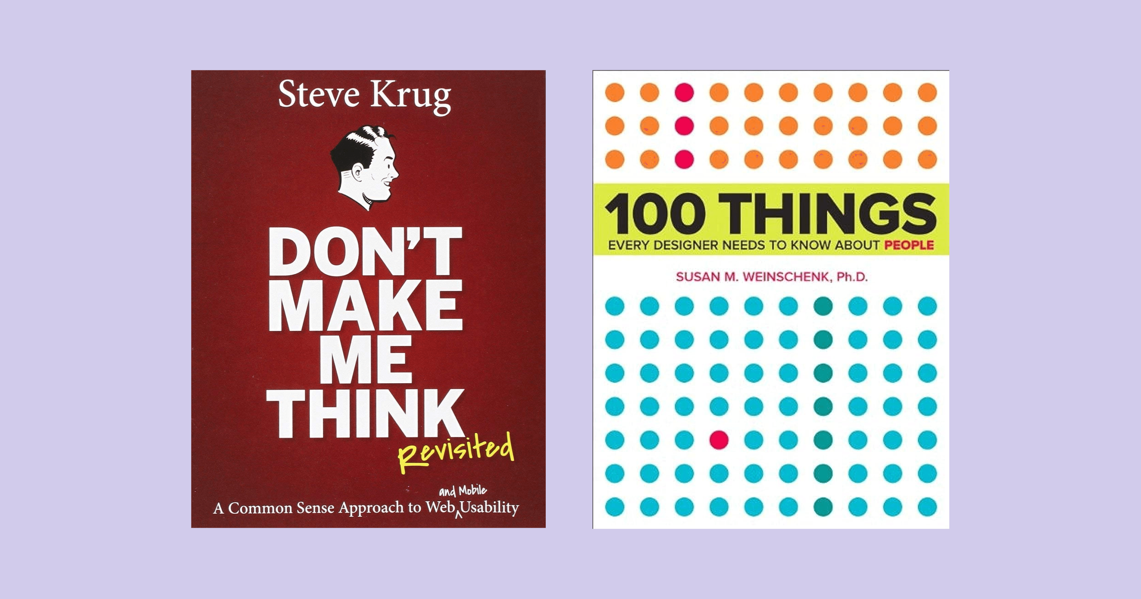
In our Design Book Club this summer, we delved into two foundational books that transformed the way we approach user-centered design: "Don’t Make Me Think" by Steve Krug and "100 Things Every Designer Needs to Know About People" by Susan Weinschenk.
This summer, our Design Book Club took a deep dive into two essential reads: “Don’t Make Me Think” by Steve Krug and “100 Things Every Designer Needs to Know About People” by Susan Weinschenk. These books transformed our understanding of user-centered design — Krug showed us the power of simplicity, while Weinschenk unveiled the psychology behind user interactions. At our recent meetup, we discussed how these insights apply to creating intuitive, effective experiences. If you’re ready to elevate your design skills, these are must-reads!
Click here to become a DBC member now and find out which book we’re reading next!

Don’t Make Me Think by Steve Krug
For any designer aiming to create intuitive, user-centered interfaces, "Don’t Make Me Think" by Steve Krug is an invaluable resource. Krug’s guide is an eye-opening exploration of usability that’s simple, engaging, and refreshingly practical. Written with clarity and humor, this book covers the fundamental principles of designing websites and applications that are truly user-friendly. What makes it special is its directness—there’s no unnecessary jargon, just straightforward advice that’s easy to digest and apply.
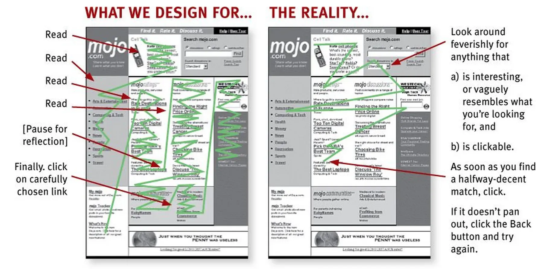
The core message, “Don’t make me think”, captures Krug’s philosophy perfectly. He argues that users shouldn’t have to stop to figure out how a website or app works; instead, navigating should be effortless. For a designer, this is a valuable reminder that the user experience is about simplicity and clarity. People visiting a site often don’t read—they skim, scan, and follow the easiest paths to their goals. Our designs should support this natural behavior, making the journey feel natural and instinctive.
One of the standout sections in the book covers usability testing. Krug emphasizes that you don’t need a huge budget or fancy lab setup to get useful feedback. Instead, he recommends doing small, informal tests with a handful of users. These quick tests, he explains, can provide valuable insights into design issues that may not be obvious to those of us close to the work. Testing early and often helps us refine designs to better meet user needs, rather than waiting until the final stages to make costly changes.

Ultimately, “Don’t Make Me Think” reinforces that good design makes things easy to use, not just visually appealing. As designers, we can sometimes get caught up in aesthetics, but Krug’s book reminds us that functionality should always take priority. With its practical approach, it’s a book you’ll return to again and again, whether you’re new to UX or an experienced designer. This book is essential reading if you want to create websites or applications that feel effortless for users.
LESSONS LEARNED:
1. Make everything obvious and intuitive
The core lesson of the book is to design in a way that minimizes user thought. People don’t want to puzzle over navigation or figure out where to click—they want an experience that flows naturally. Good design means every action and path should feel instinctive.
2. Users scan, they don’t read
Krug emphasizes that users don’t read websites in detail; they skim and quickly look for what they need. Effective design should take this into account, with clear headings, visual hierarchy, and concise, skimmable text.
3. Clarity over cleverness
Clear, simple navigation beats out clever or intricate design. Labels, buttons, and links should be instantly understandable so that users know what to expect when they interact with elements.
4. Usability testing is essential
Krug stresses the importance of regular usability testing, even if it’s simple or on a tight budget. Testing with just a few users can reveal major issues and help you catch problems early, before they become more costly to fix.
5. Design with empathy
Finally, Krug reminds designers to think from the user’s perspective. It’s easy to forget that what makes sense to us as designers might not make sense to a new user. Keeping the user’s needs and expectations front and center makes a design more functional and satisfying.

TOP QUOTES FROM THE BOOK:
1. “Don’t make me think! This is the first law of usability. It means that as far as humanly possible, when you look at a web page, it should be self-evident. Obvious. Self-explanatory.”
2. “Get rid of half the words on each page, then get rid of half of what’s left.”
3. “If something requires a large investment of time—or looks like it will—fewer people will use it.”
4. “Testing one user is 100% better than testing none, and testing one user early in the project is better than waiting to test with 50 users near the end.”
5. “Your objective should always be to eliminate question marks. You should be able to say, ‘I can’t think of a single question that people might have as they look at this.’”
These principles and quotes reinforce the power of simplicity, user empathy, and the importance of practical testing in creating user-friendly designs. Krug’s book is a great guide for any designer looking to streamline their approach and focus on what really matters to users.
100 Things Every Designer Needs to Know About People
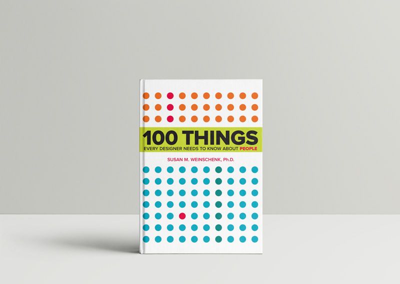
Susan Weinschenk’s “100 Things Every Designer Needs to Know About People” is one of those books that instantly elevates your approach to design. It dives into the psychology of human behavior and gives practical insights that help designers create interfaces and experiences that truly resonate with users.

As designers, we know that our job is not just about making things look good but making them work well for real people. Weinschenk’s book makes it clear that understanding psychology is key to effective design. She covers everything from perception and attention spans to memory and decision-making processes, showing how each affects the way people interact with our designs.
Here are a few standout lessons from the book that really resonated with me as a designer:
1. People don’t always make rational decisions
Weinschenk highlights that, contrary to popular belief, people don’t make decisions purely based on logic. Emotions, biases, and even context play significant roles in how users interact with a design. This is essential for designers to understand, especially when it comes to things like CTA buttons, pricing pages, and overall user flow. Recognizing that users make emotional decisions can help us design interfaces that feel intuitive and compelling rather than confusing or overwhelming.
2. Visual cues are essential for focus
One of the most practical aspects of the book is its emphasis on visual hierarchy and cues. Users’ attention spans are short, so we need to guide them to key elements on the page quickly. Weinschenk provides evidence for using contrast, color, and spacing effectively so that users know where to look first. For designers, this is a great reminder that subtle visual cues can make or break the effectiveness of our designs.
3. People are drawn to faces
Weinschenk explains that humans are naturally drawn to faces, which can be incredibly useful in design. Including faces in design (whether for testimonials, team pages, or social proof) can help create a sense of connection and trust. But it’s important not to overdo it—using faces sparingly can help maintain their impact without cluttering the design.
4. Choices should be limited
One of the most valuable lessons from this book is that too many choices can overwhelm users. The "paradox of choice" is real: when faced with too many options, people may choose nothing at all. As designers, we need to streamline user options, making paths clear and manageable, and helping users make quick, satisfying choices.
5. Memory is limited
Weinschenk’s discussion on memory was particularly eye-opening. She explains how people’s short-term memory can only hold a small amount of information at once. This reinforces the importance of minimizing cognitive load by simplifying tasks and instructions in our designs. Keeping things straightforward helps users navigate smoothly, and they’re less likely to forget what they were doing on a page.
“100 Things Every Designer Needs to Know About People” provides insight into the science behind how people think and behave, which is essential for designing products that connect on a human level. Weinschenk bridges the gap between psychology and design, offering lessons that can be applied to everything from app interfaces to website layouts. For any designer looking to understand their users better, this book is a powerful guide to creating designs that are not only beautiful but truly effective.
Reading this book has reminded me that good design is all about crafting experiences that feel natural and intuitive for the people using them. Weinschenk’s insights are invaluable for designers who want to connect with users in a meaningful way and create products that are both functional and memorable.

LESSONS LEARNED:
1. Design for limited attention spans
People have short attention spans and are bombarded with information, so designs need to grab attention quickly and keep it. Use visual hierarchy, concise text, and simple navigation to help users focus on what’s important.
2. Too many choices can paralyze users
Offering too many options can overwhelm users and lead them to make no decision at all. To avoid this, limit choices and make pathways clear so users feel comfortable and confident moving forward.
3. Memory works best with minimal cognitive load
People’s short-term memory is limited, so complex designs and tasks can lead to confusion. Simplifying navigation and instructions makes it easier for users to process and remember key information without feeling overwhelmed.
4. Emotions drive decisions
Users make decisions based on emotions more often than on logic. By creating an emotionally resonant experience through visuals, colors, and messaging, designers can foster a stronger connection and encourage desired actions.
5. People look for patterns and consistency
Users appreciate familiar patterns and predictable designs because they make navigation easier. Sticking to design conventions and consistent layouts can make a design feel intuitive and user-friendly.
TOP QUOTES FROM THE BOOK:
1. “People don’t mind scrolling as long as they know that what they’re scrolling to is relevant to what they want to accomplish.”
2. “The brain has to work harder to perceive objects that are cluttered or poorly organized, so simplicity wins.”
3. “When people are uncertain, they look around to see what others are doing. People feel reassured when they can see others’ behaviors.”
4. “People are more likely to do things they see others doing. This social influence is especially powerful when they are unsure about what they should do.”
5. “People love to see faces; it’s a social instinct we’re hard-wired for. Faces capture attention and help create trust.”
These lessons and quotes are a reminder of the importance of user psychology in design. Weinschenk’s book emphasizes that understanding human behavior helps designers craft more intuitive, engaging, and effective experiences.
And now, get ready to find out what book we’re reading next!
📚 Book #5 & #6 Announcement from the Design Book Club! 🎉
Congratulations, you've made it to the 5th design book since April! That’s an incredible achievement — you've already read over 1,200 pages from our first four books. Each one has brought new insights and perspectives, deepening your understanding of design and human behavior. As you dive into our next books (which are easy & fun to read), remember all the knowledge you've gained so far, and get ready to absorb even more. Keep up the great work and prepare for the next books which are…

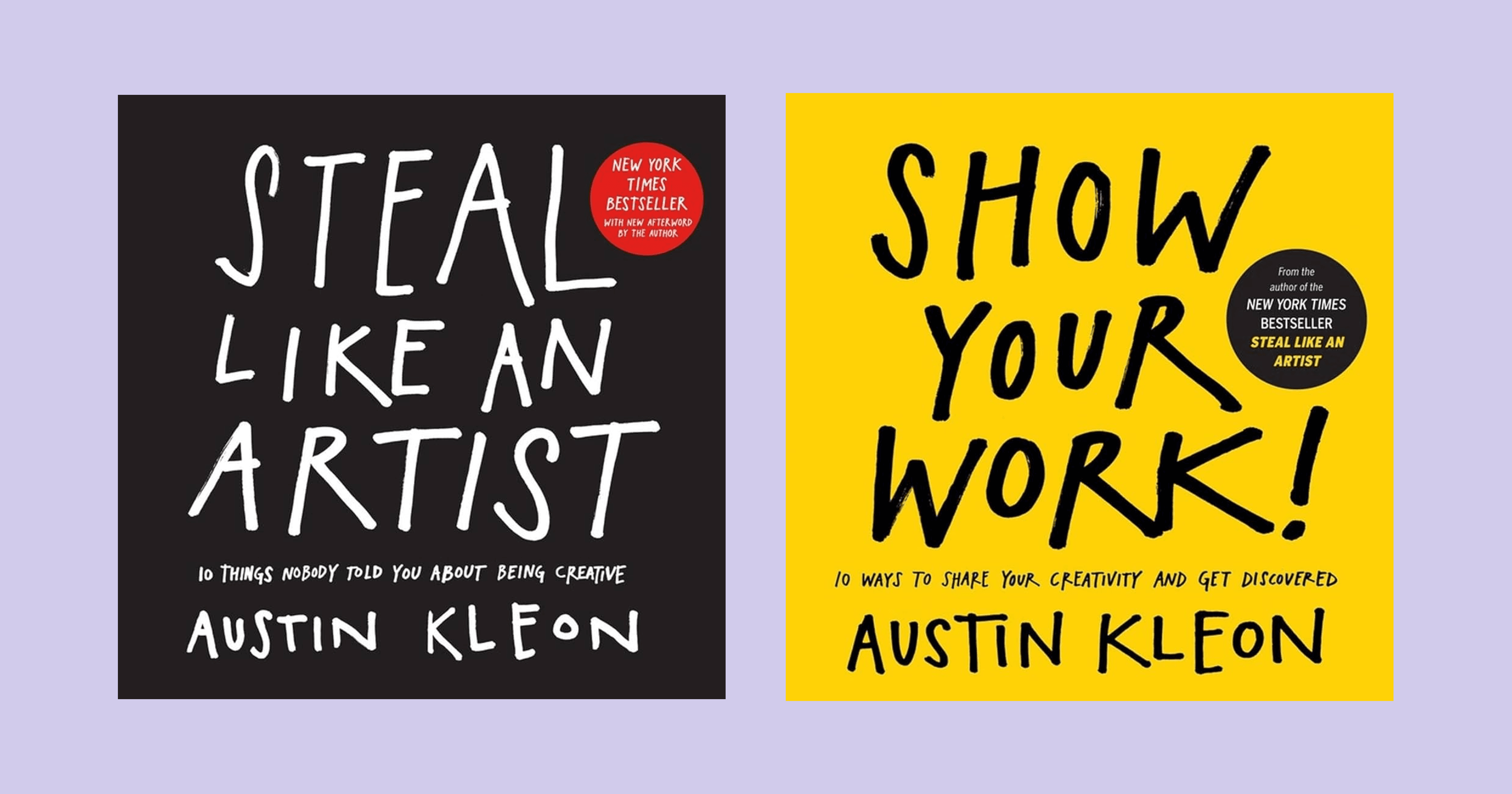
"Steal Like an Artist" & “Show Your Work” by Austin Kleon
There’s no better time to curl up under the blanket with a hot cup of tea and two essential reads than now, and “Show Your Work” and “Steal Like an Artist” by Austin Kleon are the perfect pair to kickstart your creativity this winter. Both books dive into the heart of the creative process — “Show Your Work” teaches us the power of sharing our journey and connecting with others, while “Steal Like an Artist” reminds us that creativity is all about drawing inspiration from the world around us.
Together, these books offer a blueprint for approaching art, work, and life with curiosity and openness. Let this winter be the season you explore these principles, discovering new ways to fuel your creativity and connect with others. Plus, keep these insights in mind as we come together in January to discuss how we can make the most of them in the year ahead!
Happy reading and enjoy the holiday season — click here to become a DBC member!