How QA ensures that contact forms won't block you from clients
AuthorKristijan Bujanović
DateJun 15, 2020
When we start conducting Quality Assurance activities in Bornfight, we always start by separating features and giving them priority. One of the features that’s constantly on the top of the priority list and that the clients care about is the contact form.
As contact forms are your direct link to potential customers and clients, they need to be useful and intuitive. You don’t want to have a contact form that confuses your users or completely prevents them from contacting you. Situations like these can lead to your business losing users or potential clients and ultimately result in decreased revenue.
To prevent that from happening and to ensure that every contact form we work on is fully operational, our Quality Assurance team performs a set of different activities as a way of properly testing every aspect of a contact form.

Step #01: Form Layout
When we start working on a contact form, we check if the layout of the form is visually complicated or simple and understandable for users, because users don’t tolerate complexity when it comes to forms and will easily give up if the form is not intuitive.
So what is a simple and intuitive form? It’s a form with fewer fields that are well laid out and that look easy to complete. Here’s a good example of a form that is visually clear, well laid out, and understandable.
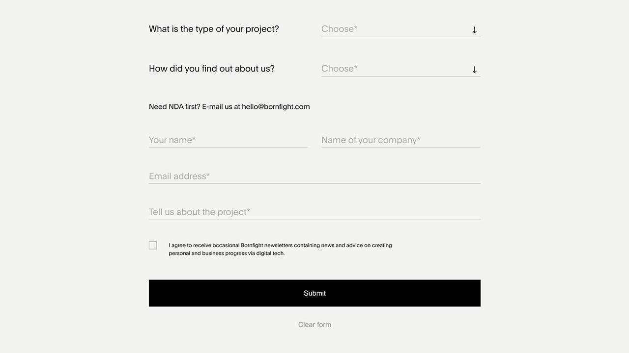
Having a form like that can ultimately result in a much higher submission rate, than one with a much higher number of fields or a more complex layout.
Step #02: Form Fields
All forms come with different types of fields, depending on the information that needs to be filled. These 4 are some of the most used ones:
- Checkboxes
- Input text fields
- Radio buttons
- Dropdown select
With form fields, our goal is to make sure that all fields are clickable and the user can enter the needed information into them — whether it’s text, numbers of anything else that is needed.
Since a lot of forms have custom elements within them, we test them across a variety of platforms in order to make sure that all of them work properly in all browsers and devices.
Step #03: Required Fields
When testing required fields, we first click on the SUBMIT button to see if the form validation highlights the required fields correctly and that error messages are properly displayed for each of the required fields.
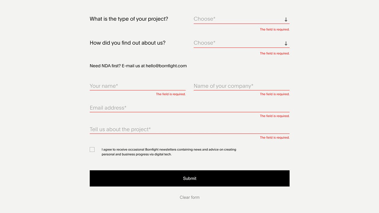
PRO TIP: A good practice is to always mark required or mandatory fields with an asterisk—users are used to seeing them and it’s a simple way of clearly showing if users need to fill a specific field or not. Another element that is good to implement is a short statement that says that fields marked with an asterisk are mandatory — this makes it much easier for users to understand which fields they have to fill in and which ones are optional.
Step #04: Validation
There are 2 types of validation:
- Inline validation
- Submit validation
Inline validation is performed automatically as users enter information into the form. It happens on every interaction and it displays a message immediately after the user types in data.
Once the form is submitted, that is when submit validation takes place. As opposed to inline validation that gives immediate feedback to the user, if a form has submitted a validation and there are any problems with any of the fields, feedback will not be given to the user until they click on the SUBMIT button.
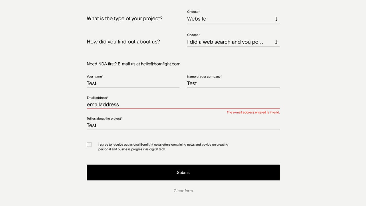
Step #05: Validate Input
Another aspect that we test is the input validity and the specifics of validation messages. In order for a form to be fully operational, it needs to be able to prove the validity of the information written into a specific field (like an email address or a telephone number). As information entered into a specific field needs to be written in a specific format (for example, a phone number field can’t accept letters, just numbers), we conduct testing to ensure that the fields work only when the correct format is entered and that the users know what that format is.
Forms that have this properly implemented will display a clear validation message and notify users that their email address (or a phone number or any other information) has been entered incorrectly.
However, some forms can go over the top by preventing users from submitting a form because of a specific requirement on a field that, and combining that with an unhelpful validation message — performing QA testing is one of the ways to prevent that your form doesn’t end up in this category.
During our testing, we cover all of the specific use cases and explore what happens if we input text into fields that may expect a number or if we enter an incorrect email address into an email address field. In addition to that, we test a variety of punctuation marks to see how the form responds, as some forms may actually prevent certain characters from being entered due to potential security risks.
Step #06: Validation Messages
Any validation message displayed next to a field serves to help the user and inform them about the problem. That is why we check if implemented validation messages correctly describe the problem, such as whether a specific field is required or whether the input is incorrect.
To conduct this type of testing, we follow this mindset: “as a user, would I understand this validation message that is displayed?”
Step #07: Other Validation Elements
Some forms will explicitly mark when a field has been completed successfully, and display a small cross if the completion is unsuccessful.
When testing, we always make sure that the correct checkmarks or crosses are displayed based on what has been entered into a specific field (if anything is entered at all). For example, when a user enters correct information into a field, it makes perfect sense to display a green checkmark next to the field, but that would be absolutely pointless if a user hasn’t entered anything.
Step #08: Form Tab Order
When it comes to entering information into a form, it should be possible to fill in a form by using the TAB key on a keyboard as a way of moving to the next field. This is important as it improves the accessibility of a specific form.
This is a simple test where we check if the form even has the possibility of of tabbing through a form in a specific sequence and if the cursor is correctly placed into the next field every time we press the TAB key.
Your browser does not support the video tag.
An extension of this test would be to check for the possibility of completing and submitting the whole form just by using your keyboard.
Step #09: Tooltips
Certain forms have tooltips or help information that appears by either floating over each field or over an icon next to the field. During our testing, we make sure that each tooltip appears correctly and that the displayed messages (if the form even has them) are understandable.
Step #10: Prefilled Fields
Certain forms will automatically prefill some fields. For instance, if you click on a link to enquire about a product or a service, the resulting form may already have that product or service preselected in the relevant field. This is a great way of simplifying the process of filling out a form, and it provides users with a much more streamlined experience, so if a certain form has the potential to implement such a feature or already has it implemented, QA will ensure that every combination is properly connected and that the right fields are filled with the right information.
Anything that cuts down on the user having to complete a field is of great importance as it will help to increase the conversion rate for that form.
Step #11: Thank You Page
After a form has been submitted, a user needs to get a confirmation that everything was successful. That is why we make sure that a thank you page with a relevant appreciation message is displayed to the user after a form has been successfully submitted.
Your browser does not support the video tag.
Step #12: Email Confirmation
Certain forms will email a confirmation to the user saying they have completed the form and showing appreciation for their submission. In case that a form requires a follow-up action (that is usually the case with registration forms) then a user should receive an an email confirmation message that contains all of the details explaining what that follow-up action is (such as clicking on a validation link to confirm the registration).
If the confirmation email is an HTML email, then it is a good idea to complete this test a number of times across different email clients — we do it to ensure that the confirmation email displays correctly and that any and all links within the email work correctly across Gmail, Yahoo Mail, etc.
Step #13: Form Actions
When a user completes a form, another thing that should also happen is that a form submission email should be sent to you (or the operator of the website). This email should provide all the details about the submitted form, together with the information entered into specific fields.
During the testing phase, we ensure that this email is delivered in a layout that is easily readable, as it will enable everyone who needs to work on form submissions to have a clear overview of the entire situation and a more streamlined workflow.
Another element we test during this phase are additional actions. For instance, saving the form into a database or possibly an integration with an email marketing or a CRM system. These aspects ought to be thoroughly tested to confirm that the data from the form is accurately saved or that it finds its way across to software it is integrated with.
Step #14: Browser Testing
As users access forms through a variety of different browsers, it is very important to test them across a majority of the most used ones. We do this to ensure that the layout of the form, any inline validation messages or core functionalities (like a submit button) don’t get broken on certain browsers (or their versions) which would prevent users from completing them.
Step #15: Mobile Testing
To ensure that forms work on all platforms, we round up the test by making sure they perform as planned on mobile devices, such as iPhones, iPads and a variety of Android devices.
As you might have noticed, it can be very difficult to complete some types of forms on a mobile device, especially if there are a lot of fields. That is why our testing focuses on ensuring maximum functionality, like detecting if all elements (such as radio buttons or checkboxes) and that users can navigate through the form without any issues.
A good mindset to have is: “if you get fed up when testing the form, then users will feel the same way filling it in”.
Step #16: More Forms Testing
In addition to all of the testing activities we mentioned above, depending on the specific type of a form and the needs of the client, we also conduct additional types of testing accessibility, security and usability. They consist of specific activities, and you can learn more about them on our page about Quality Assurance.
The contact form is one of the most important elements of the website
The contact form represents one of your first touchpoints with a potential customer — and it’s all about maximizing user experience. The less effort they have to take to go through the process of filling out the form, the happier they will be and the higher will be the rate of completion.
If you have a frustrated potential customer who is struggling with completing the form, you will end up with no customer at all. That is the main reason why we always take more time to ease the process, making sure every part (visually and functionally) is at its best.
Within the Quality Assurance team, we always like to say that the point when users make a really strong opinion of you is when they try to reach you — that is the point when you are most relevant to them. And that is why we place such a strong emphasis on making sure that every aspect of a contact form performs flawlessly.